EXPLORATION
Competitors Analysis
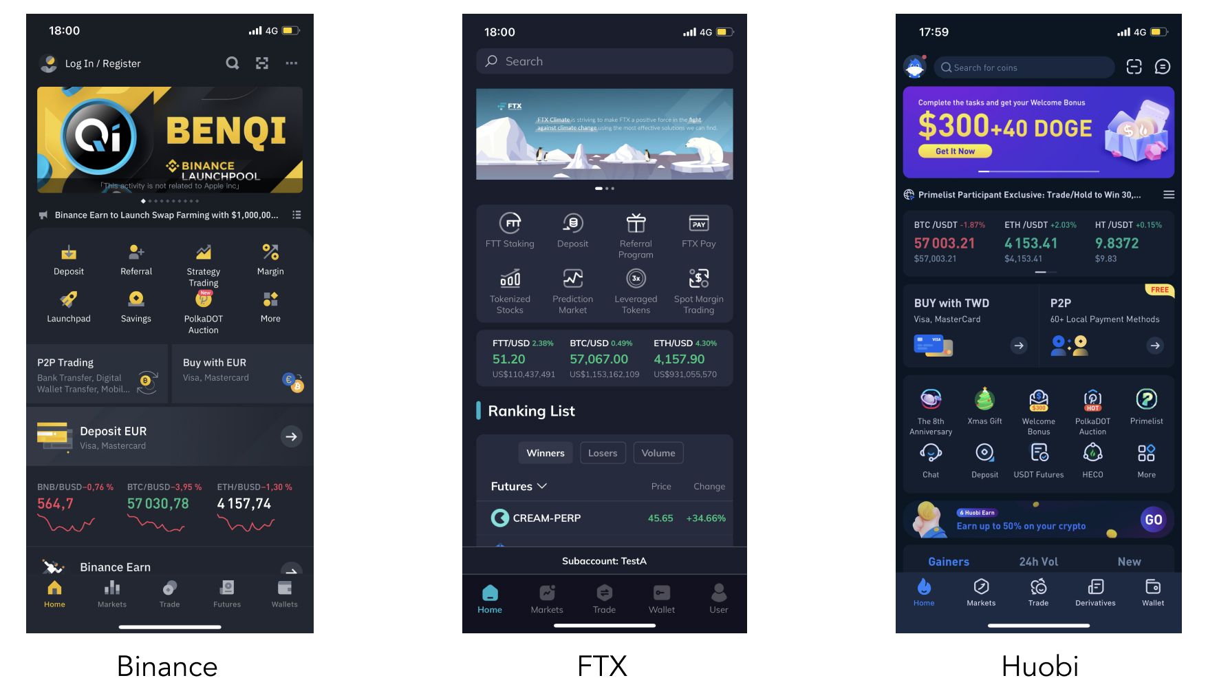
The 3 exchange platforms that have the highest amount of daily user (Binance, FTX and Huobi), also share the same concept of home page:
- Marketing page with carousel and ads.
- Main navigation entrance with several features/services proposed.
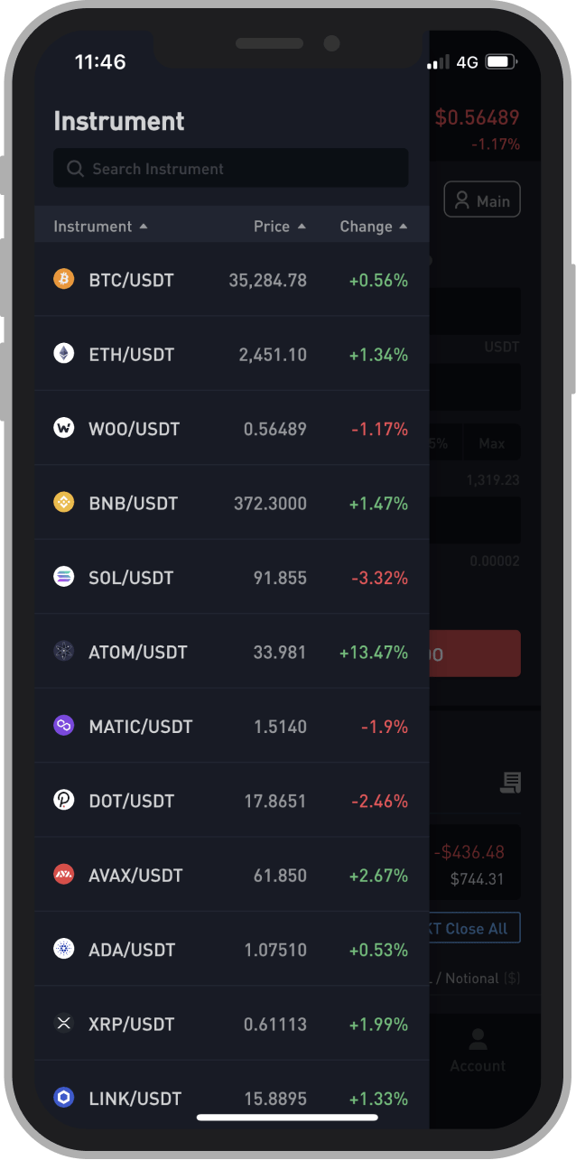
- Market page displaying all tokens' prices.
- Is it really what the user is looking for? - As a trader, is it the first thing I want to see when I open the app?
User Flow
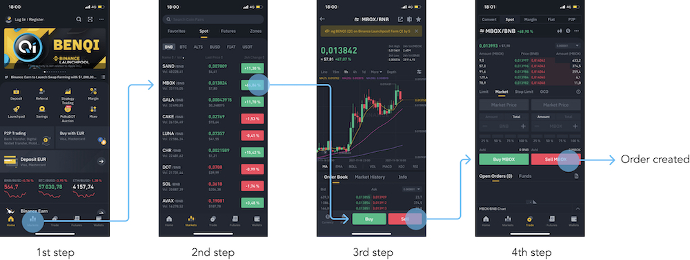
We chose to go further and analyse the user flow of the most critical actions done by a user: buy, sell, close a position and check a price (those actions have been defined during the UX Research).
Let’s take an exemple from Binance app. User needs 4 steps to perform a trade. In the case of market crash (i.e. market prices are suddenly dropping), user is not able to adjust its strategy properly.
Interviews with daily crypto-traders
In order to find out weak signals and help us in the design decisions, we conducted user research. Several interviews have been done from the UX Researcher hand-in-hand with in-house crypto-traders. Here is a sum up of main user's needs:
- The first information user wants to see after openning the app is the total balance.
- User wants to be able to quickly sell/buy an asset from the home page.
None of the current exchange platforms answer to those needs.
Let's design it!
INFORMATION ARCHITECTURE
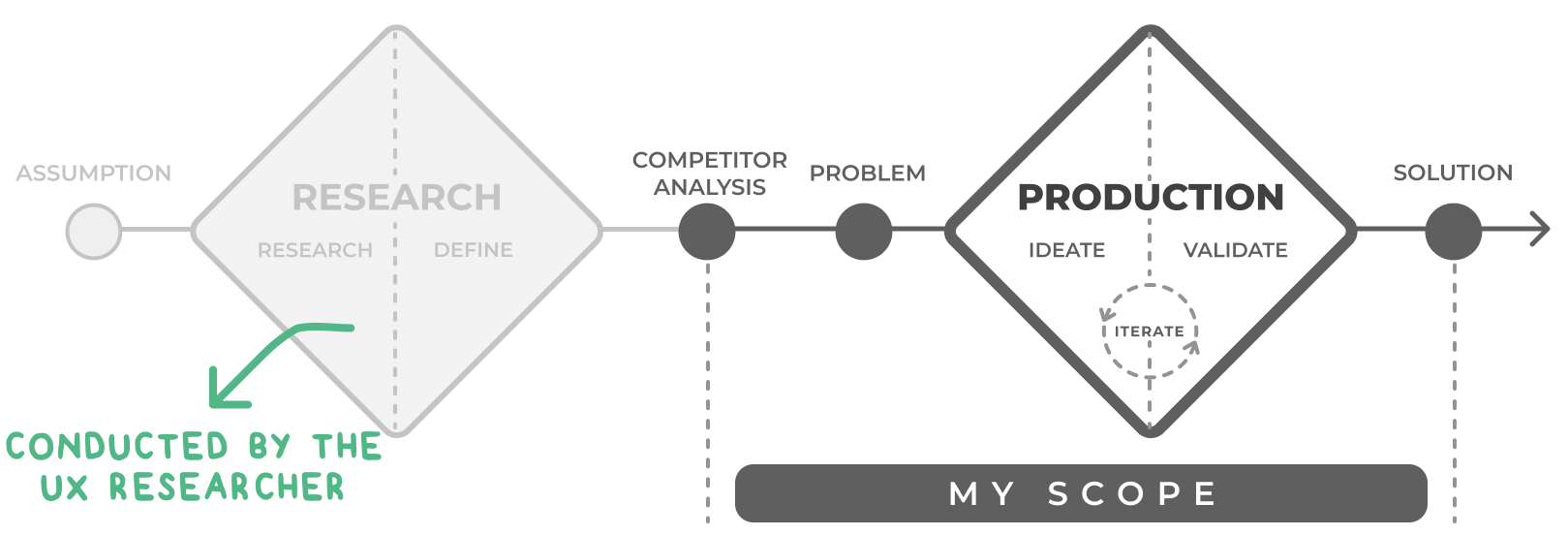
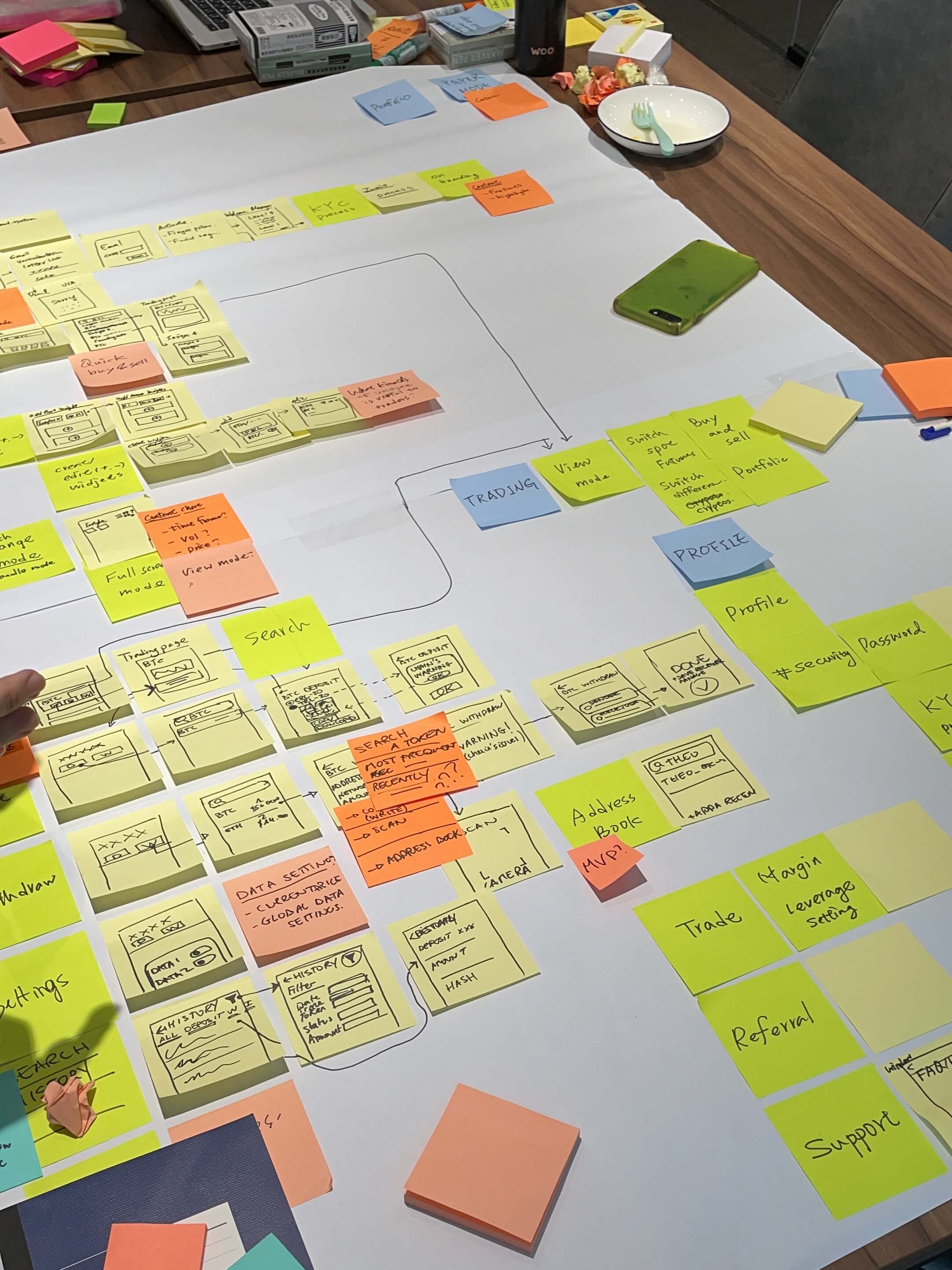
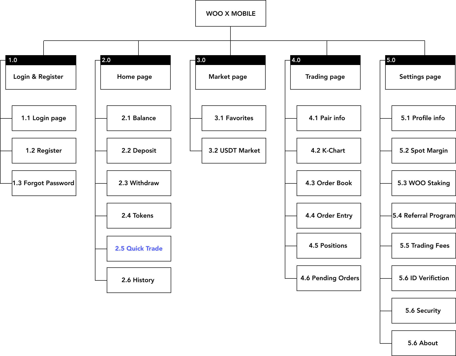
We wanted to involve all the design team for building the information achitecure. That is why, I organised and led 2 design workshops.
Below is the output we got after the workshops. For this portfolio, I chose to showcase the Quick Trade feature, located in the Home page (2.5).
IDEATION
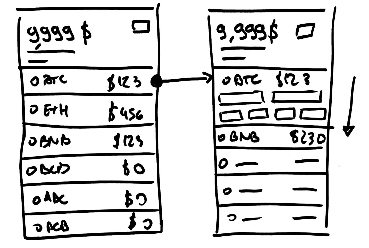
Traders like to see the balance
Based on previous user interviews, traders want to see and take actions quickly, so we designed a home page with 2 components:
- user’s balance (i.e. what the user owns),
- list of the supported pairs on WOO X.
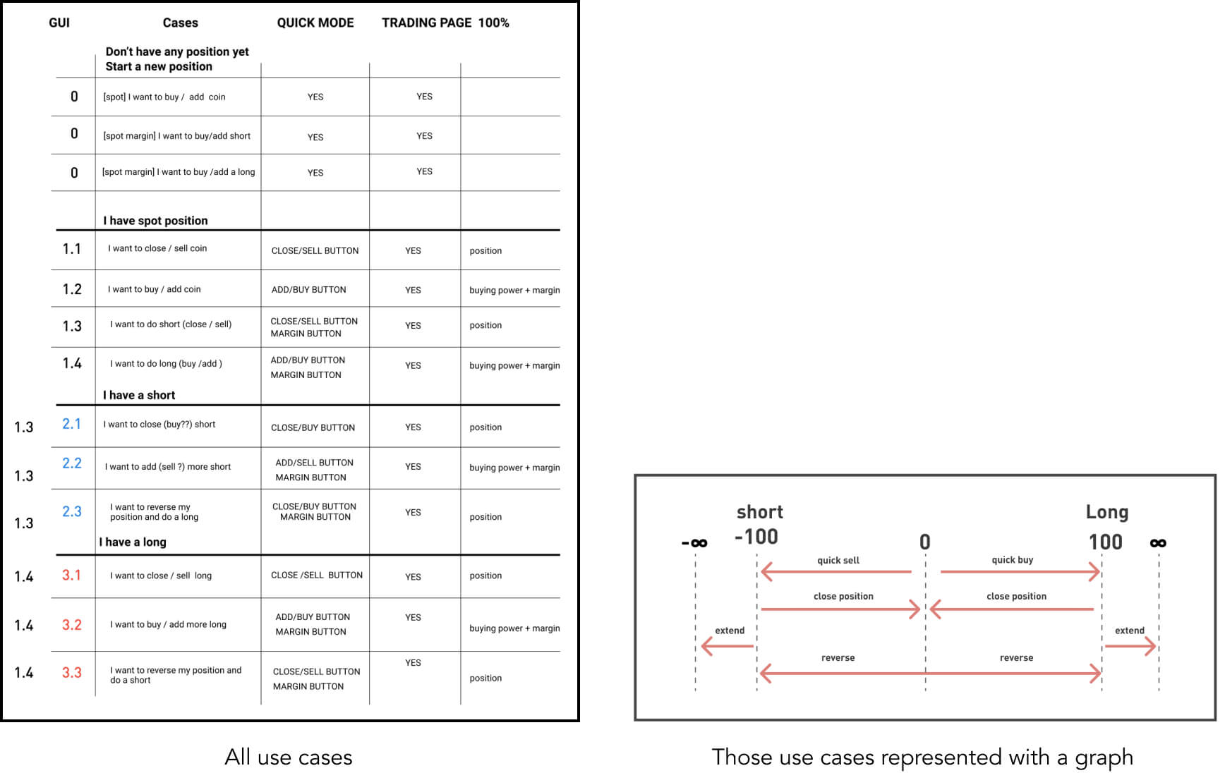
Empower traders to perform fast trades
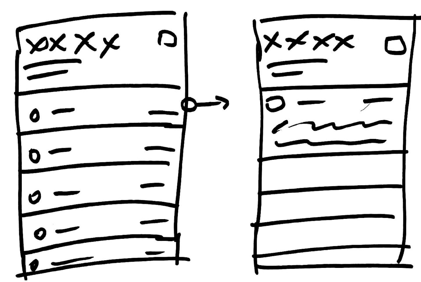
User can expand each row and have access to the quick trade panel. From there, user can perform simple actions, such as close a position, buy, sell. If user wants to perform more complex trade, the bottom right button redirects to the trading page.
 1st hand sketch
 2nd hand sketch
 Final wireframe
In order to keep the layout net and easy to understand, we iterated the structure until we found a good balance between functionallities and context. The purpose here is not to create a new trading page within the wallet, but to provide the minimum features needed to edit a strategy in a rush time.
Several iterations with traders
Hand in hand with high trading volume traders, we conducted several usability tests and obtained enriching feedbacks.
As a part of the experiment, we realized interaction research for a version 2 of the quick trade panel. However I am not able
to detail those research in this portfolio...
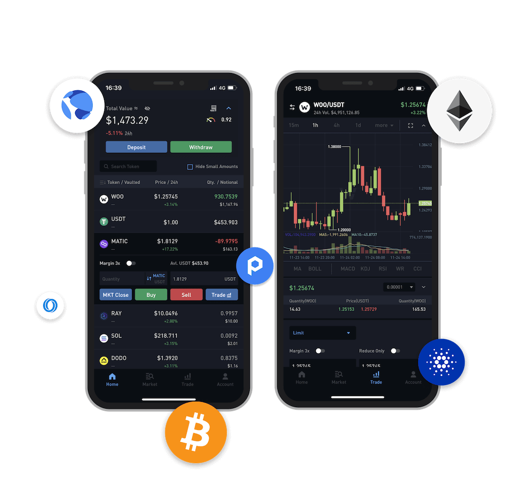
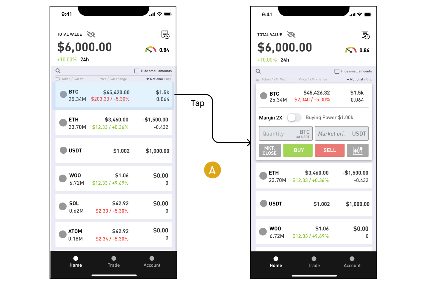
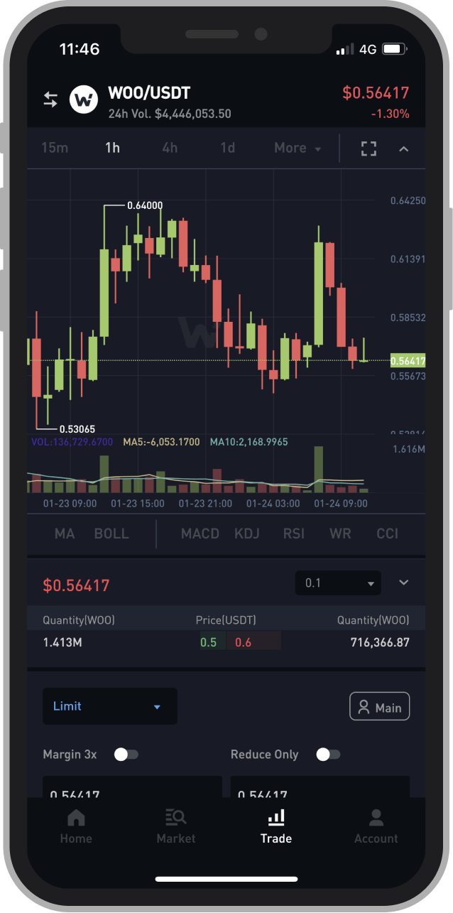
Final Quick trade component
After days of wireframes and figma boards, we came up with this final solution:
- Token's information: icon, label, volume, price, 24h changes and user's notionals.
- Buying power: margin toggle and user's buying power.
- Order Entry: quantity and market inputs, and button for shifting to quantity's base.
- Action buttons: market close, buy, sell and go to the Trading page.
FINAL DESIGNS
The following designs shipped publicly to everyone across the world.
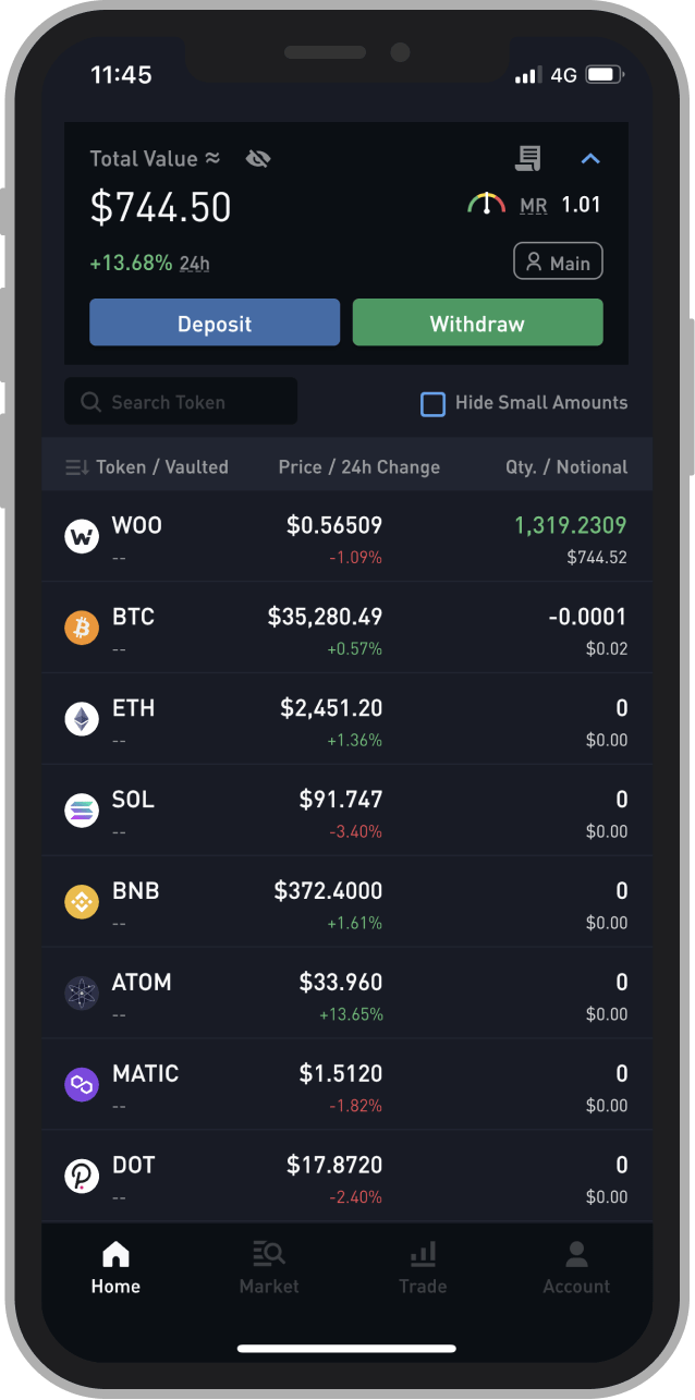
Home page
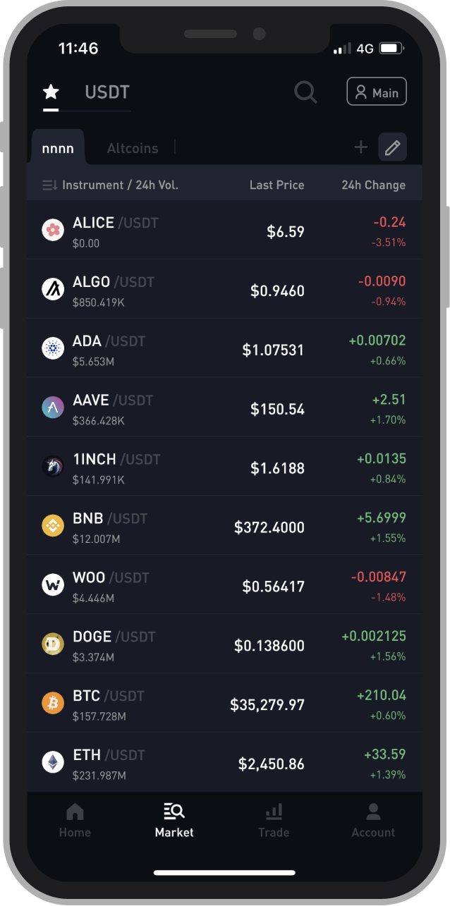
Market page
Trading page
Trading page - left panel
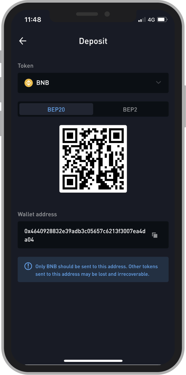
Deposit BNB
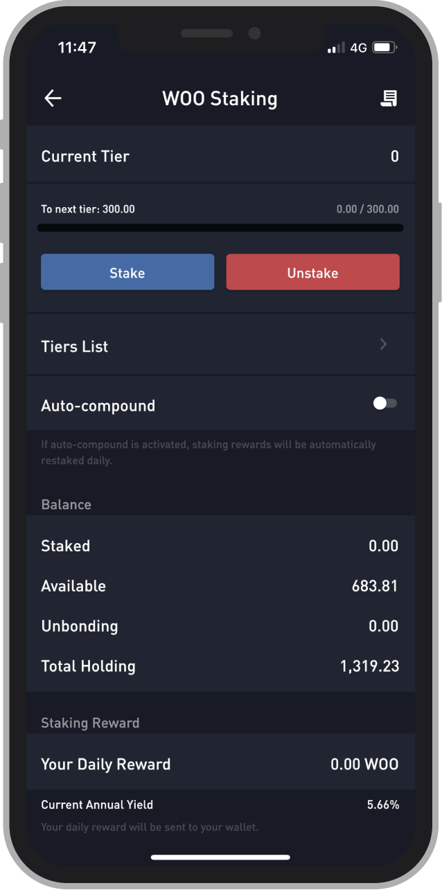
Staking page
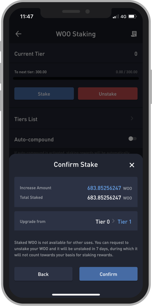
Staking page - Confirmation
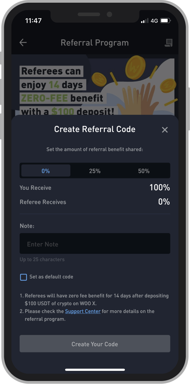
Referral page - Create new code
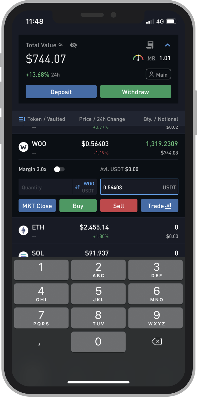
Home page - Quik Buy
People love WOO X
The launch of WOO X app was a huge event for the WOO Network team and the community members:
- we received tons of positive feedbacks from users through social media (people took screenshot of the app and posted it on Twitter).
- the app has an average of 5✪ on App Store and 37 reviews (updated 01/06/2022).
"This will be a game changer.
The app, the myth, the legend!
@WOOnetwork"
"WOO X iOS app is Smoooothhhhhh!!!
Love It!!!
Bullish $WOO"
"Only up. $WOO
Btw, what a nice layout on the WOO X app
@WOOnetwork
#WAGMI #WOORIORS"
"WOO X IOS BETA looking fineeeee"
"@WOOnetwork’s new app looking insanely nice! Free trading for all till Sep 2nd, 1800 $WOO [...]
Let’s go!"
"Beautiful interface and smooth run
Really impressed, hope to see more and more currencies listed in the future"
"Perfect
Good user experience, may add long-term PBL tracker?"
"Impressed trading experience!
Great experience!"