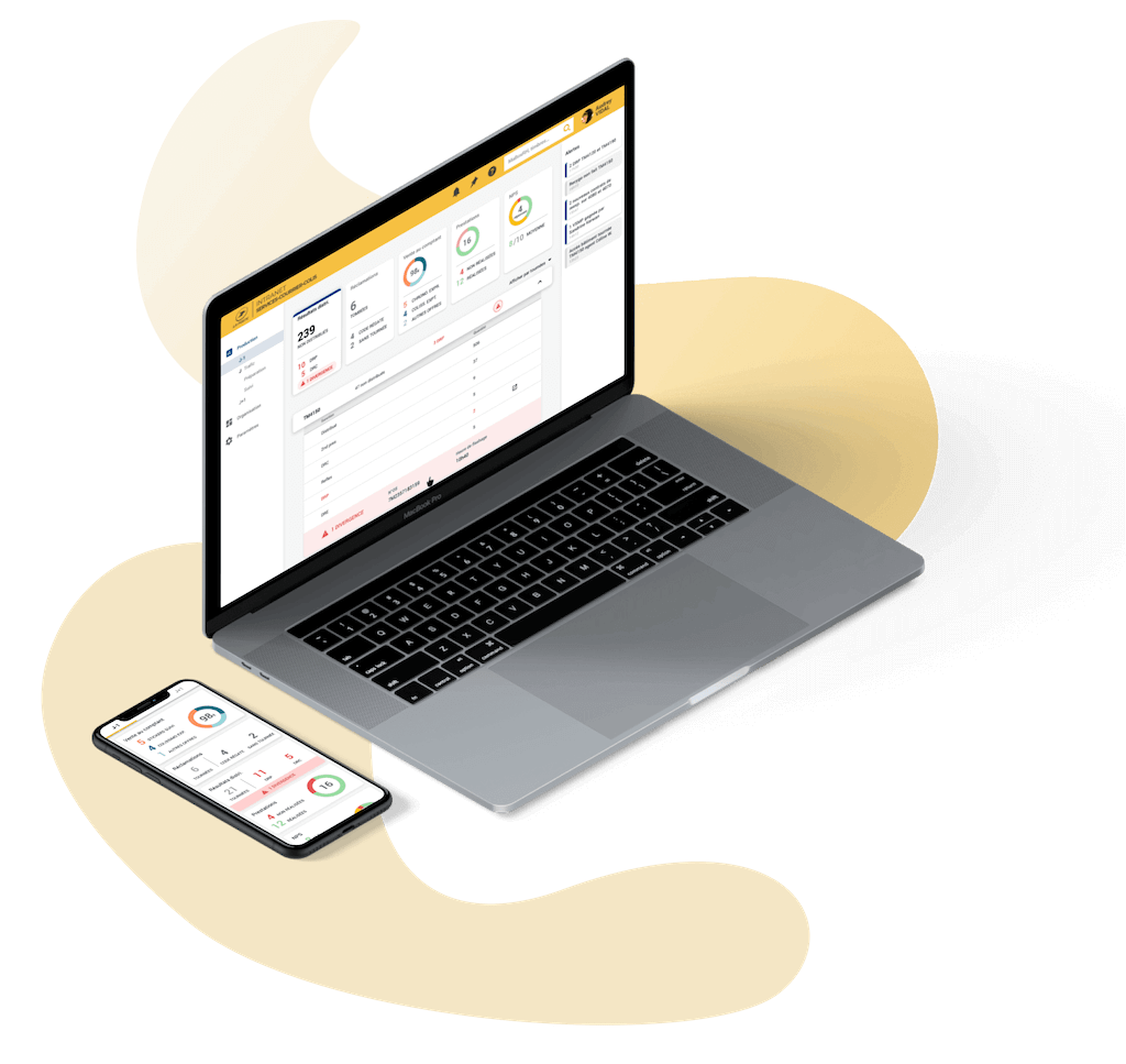
Management Tool
Assist Delivery Station's Operations Managers.
Role User Research, UX & UI Design
Exposure +20,000 daily users
Year 2020
The information in this case study is my own and does not necessarily reflect the views of La Poste and HDG.
Assist Delivery Station's Operations Managers.
Role User Research, UX & UI Design
Exposure +20,000 daily users
Year 2020
The information in this case study is my own and does not necessarily reflect the views of La Poste and HDG.
2020 and 2021 were significant milestones for La Poste (the National French Post Company). After receiving complaints from delivery stations regarding the lack of coherence and efficiency of the intranet, La Poste decided to develop a new management tool.
I was part of an ambitious project that aims to assist and support Operations Managers in their daily activities in one of the oldest French companies.
La Poste’s Operations Managers use more than 15 apps everyday. Through these apps, they have access to team's results, distribution rate, incidence rate, claims etc...
Obviously, when user is searching data among 15 different apps, it leads to a waste of time and a lack of productivity. How to resolve this and give back time to managers? How to let managers spend more time to manage people instead of searching for a data in tons of apps?
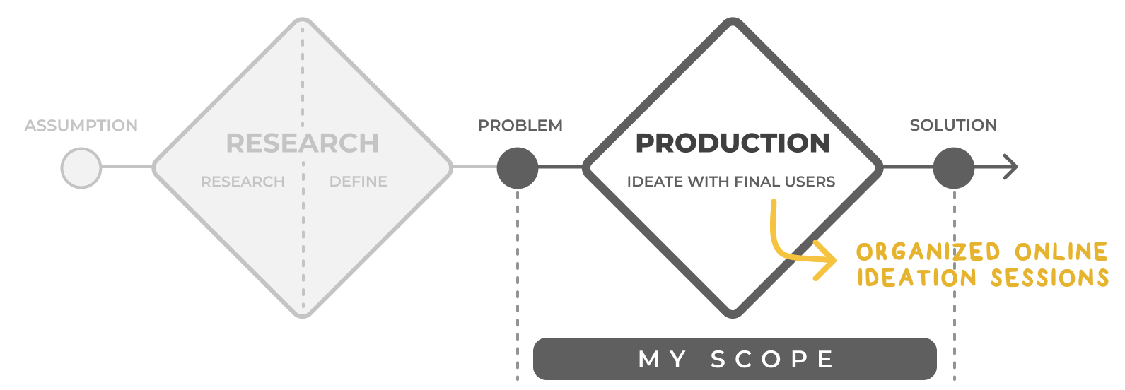
Design Process inspired by the Double Diamant. British Council, 2005.
Since we aim to improve people’s work, I followed a user-centric process: from prioritizing their needs to usability testing.
The design process followed a MVP approach, so we prioritized and de-prioritized features accordingly.
Hand in hand with in-house designers I gathered key insights from previous observations sessions. These key insights served as the breadcrumb of our user-centric process.
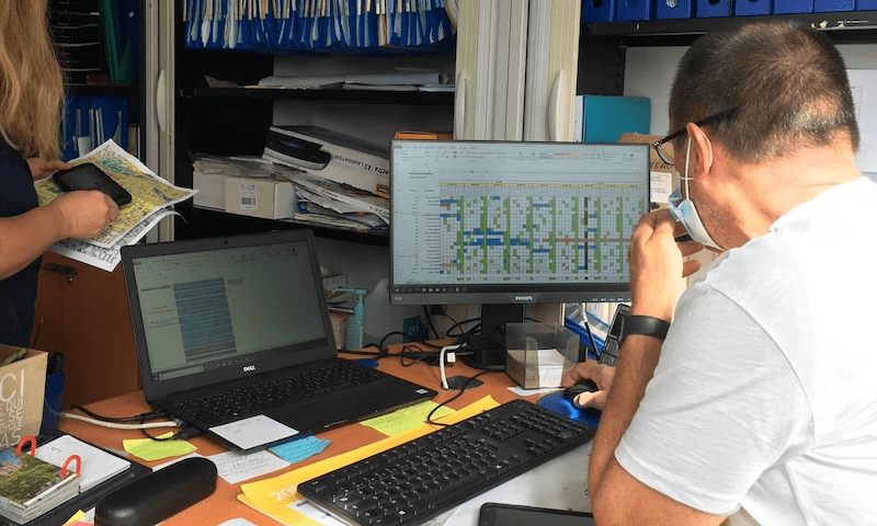
Photo credit: Nicolas Fèvre
In order to develop and design a tool which will give support and assist their everyday tasks, we needed to understand and be aware of managers’ schedule, task after task. Thanks to in-house ergonomic engineer, we had access to this data.
There are 2 types of Managers:
Something to highlight here: those positions are not fixed and can evolve over the month.
We grouped Managers' activities into 8 categories: Organisation, HR, QA, Claims, Distribution, Reshipping and Delivery.
Thanks to a new online workshop, we co-built a ranking of the most important and urgent activities done by the managers.
Because of COVID-19, we couldn't organise onsite workshop. That's why we used Miro. Miro is a powerful tool for collaborating with your team. It fits many design step, from brainstorming to ideation process.
Operation managers face a dilemma everyday, by talking with them we realised that an activity can be urgent and/or important:
Below is the result of the workshop:
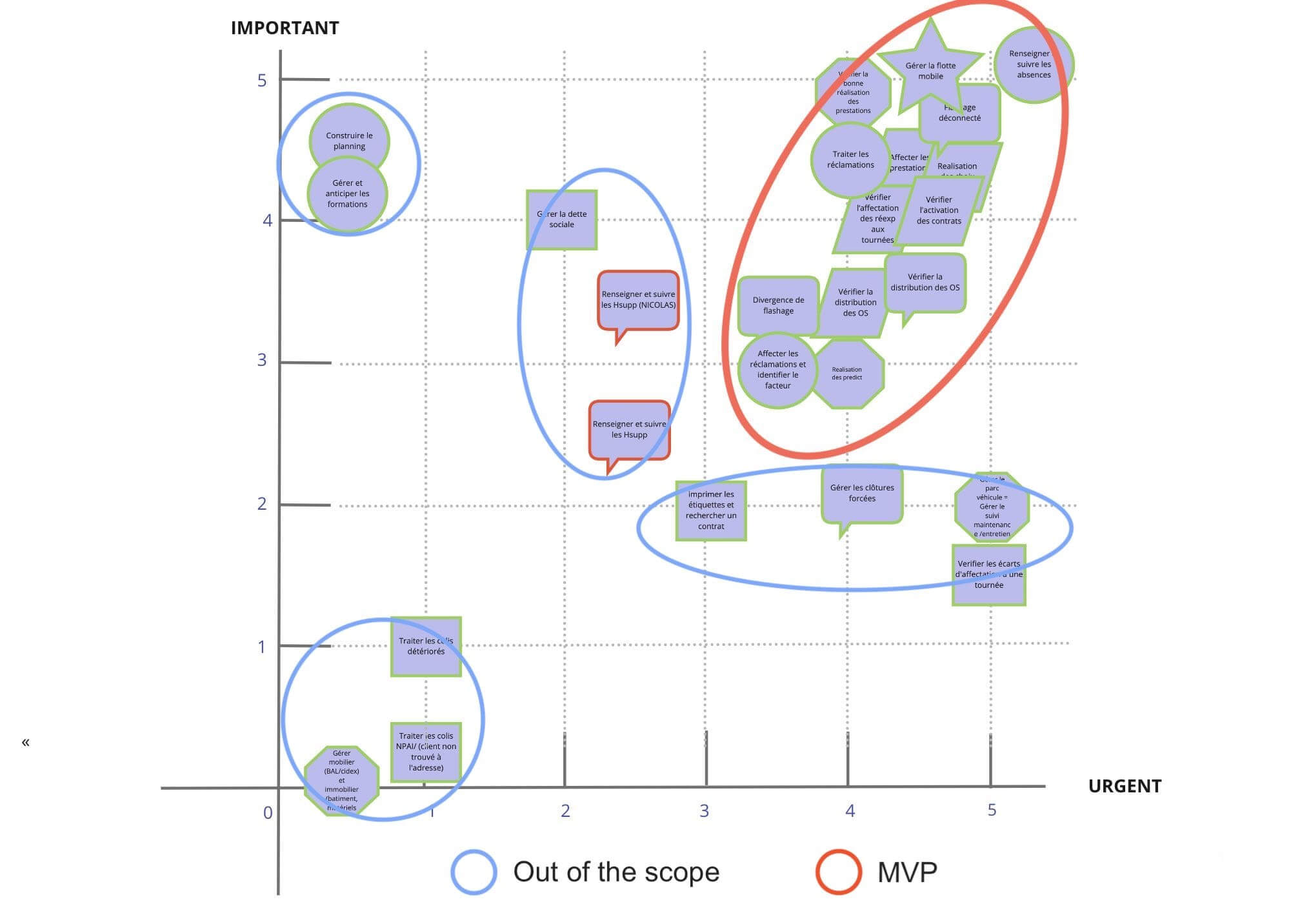
We decided to focus this first version on resolving the problems with the highest scores in both importance and urgency.
In order to build the mental model, we used previous’ workshops as insights. Here is the result:
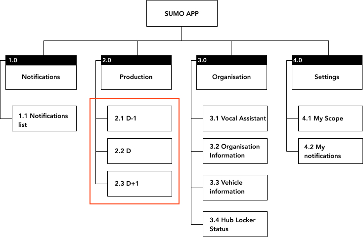
We know that operatives have a working day splitted into 3 periods:
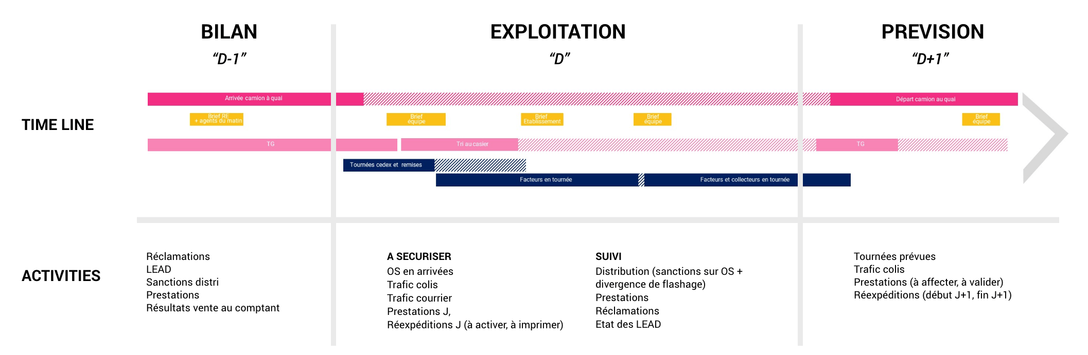
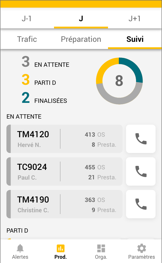
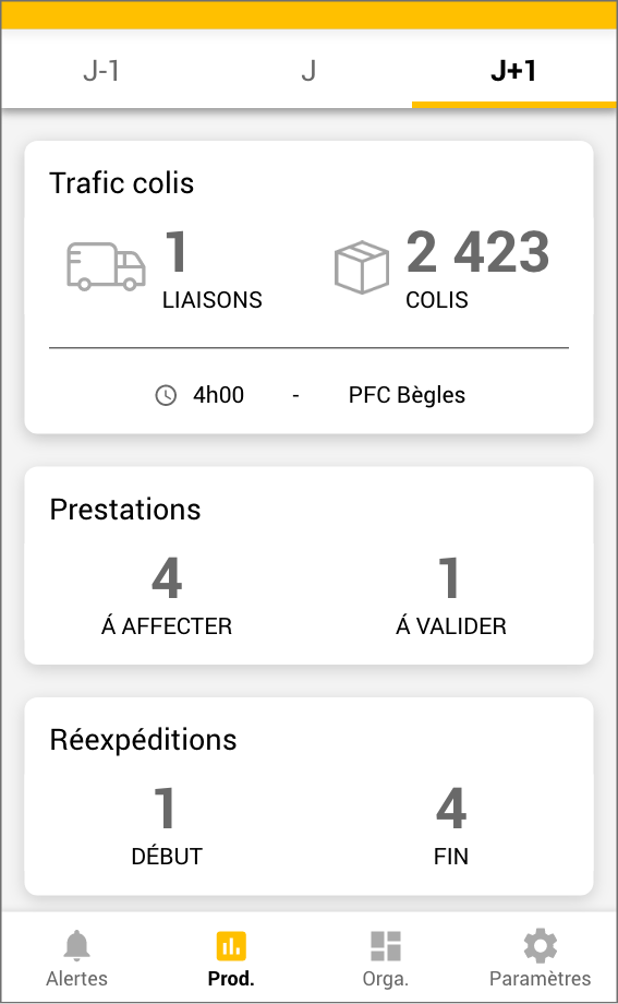
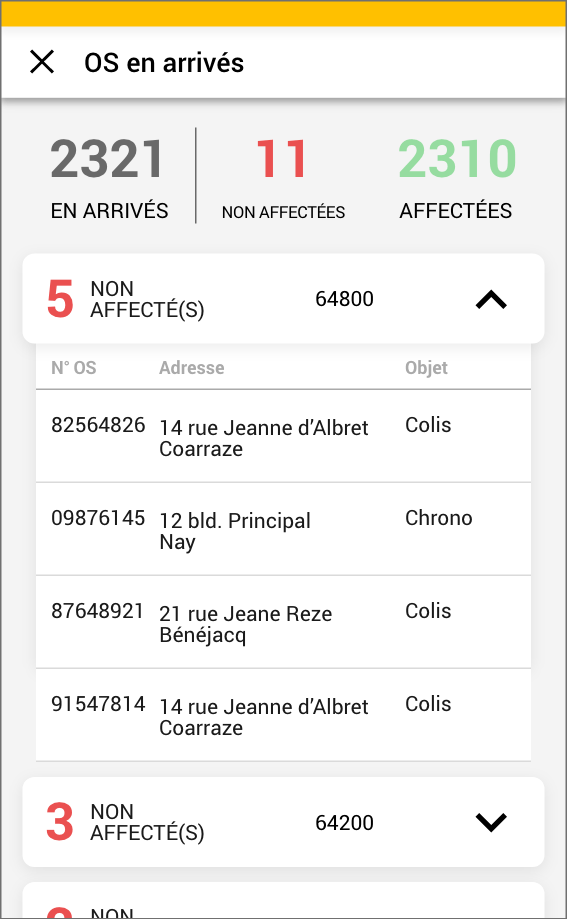
Each period of time required different indicators and data. So we decided to incorporate those 3 periods within the "Production" tab of the app. After this stage, we had the main infrastructure:
Using Miro, participants moved components in order to create the dashboard they wanted. For each interface which may raise an issue, we collected users' ideas, discussed about them and made a final decision.
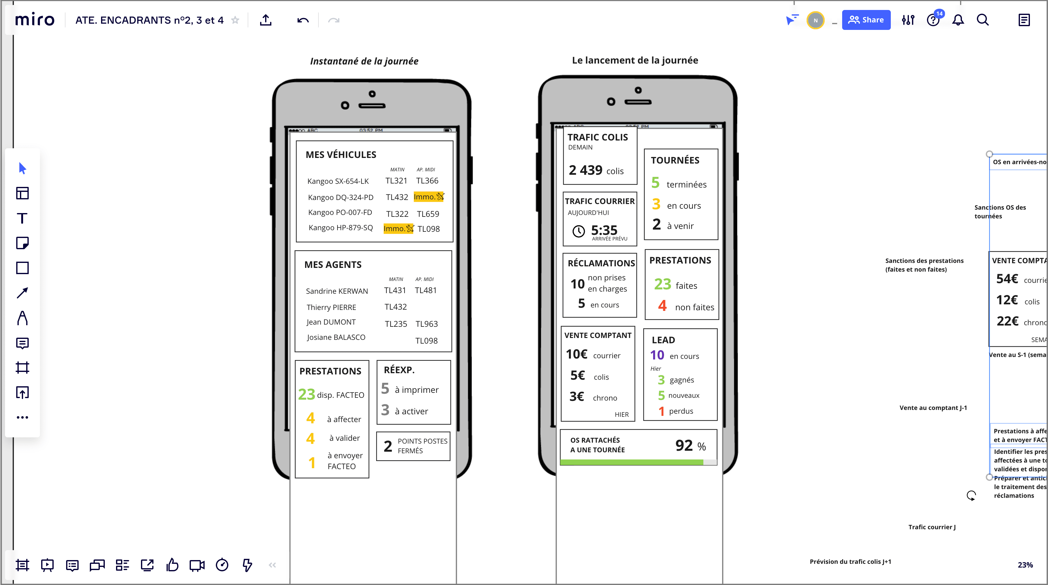
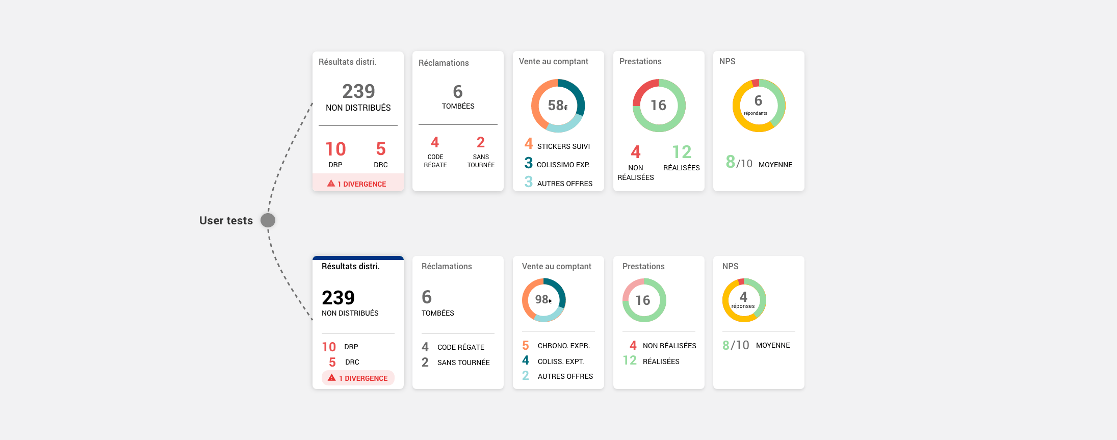
For example, we redesigned this view 2 times after proceeded user tests.
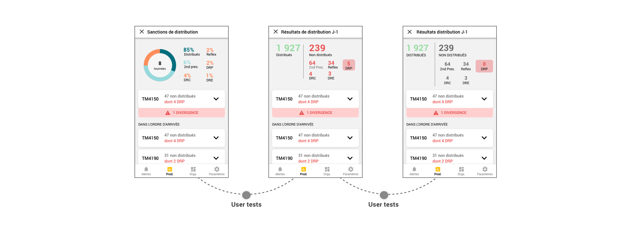
Even though COVID-19 was spreading in August 2020, we had the autorization to make onsite user tests.
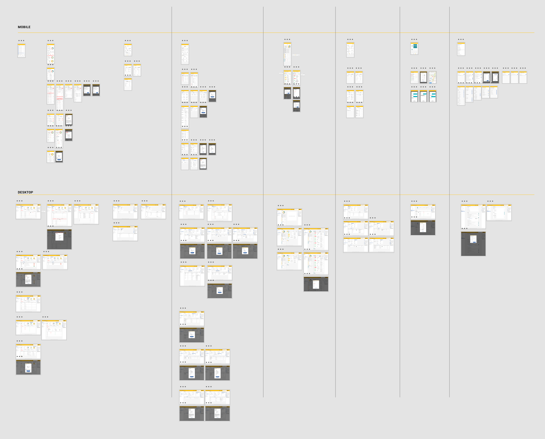
More than 120 mockups has been made for project (mobile & desktop). We did our best to use and respect a full design process. I am proud of the work we did in a short time and with these sanitary conditions.
The following designs shipped publicly to everyone across the world.
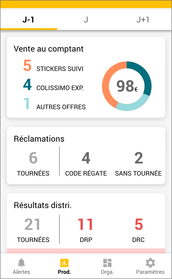
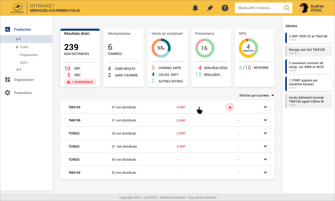
D-1 Results
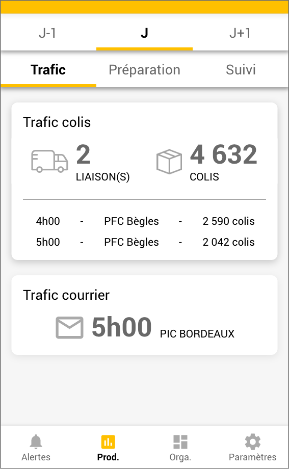
D1 Shipping
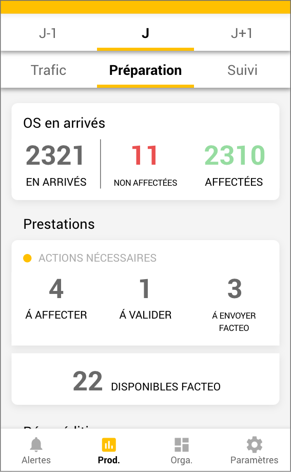
Preparation Delivering
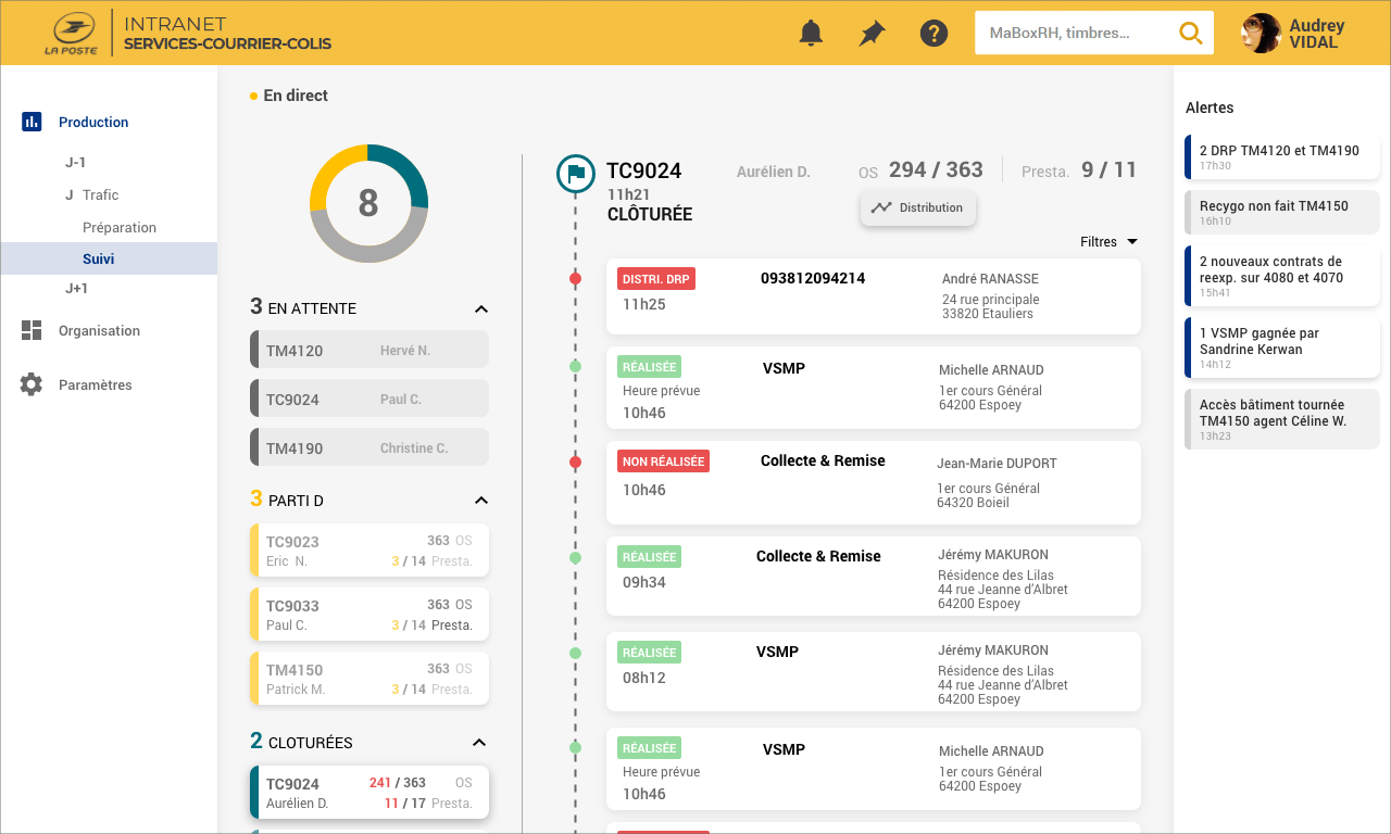
Tracking Production
Delivery Estimation
Tracking Live
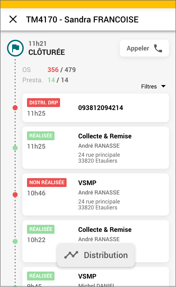
Tracking of one delivery
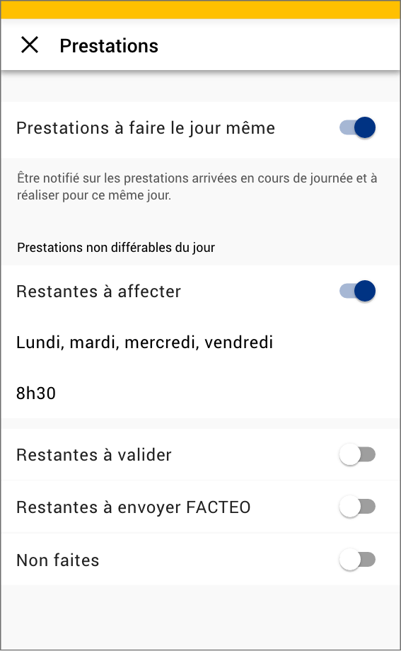
Settings
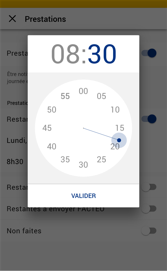
Settings
At the time I am writing those lines, the project hasn’t been launched yet. It has been deprioritized since the Covid 19 seriously impact La Poste quality service.
On the other hand, La Poste also needs to deal with the significant reductions in letter volumes and the constant increase in parcel shipping volumes. It leads to a brutal and deep jobs reorganisation and the launch of new services and products.