French Post's Intranet
Give useful information and feature to 100k daily users.
Role UX & UI Design
Exposure +100,000 daily users
Year 2019
The information in this case study is my own and does not necessarily reflect the views of La Poste and HDG.
Give useful information and feature to 100k daily users.
Role UX & UI Design
Exposure +100,000 daily users
Year 2019
The information in this case study is my own and does not necessarily reflect the views of La Poste and HDG.
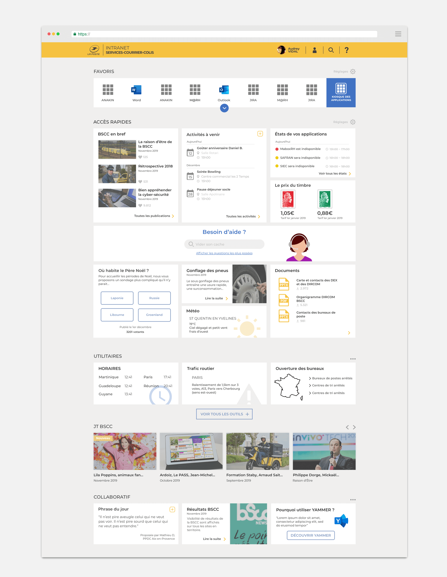
French post workers have access to an intranet where they can find content management tools, documents/resources and internal communications.
Based on the IT unit's tracking data, the platform is not being used as intended. Additionally, the feedback received is largely negative, as people do not like the content and features proposed.
How to design an intranet that bring real added-values to La Poste's employees?
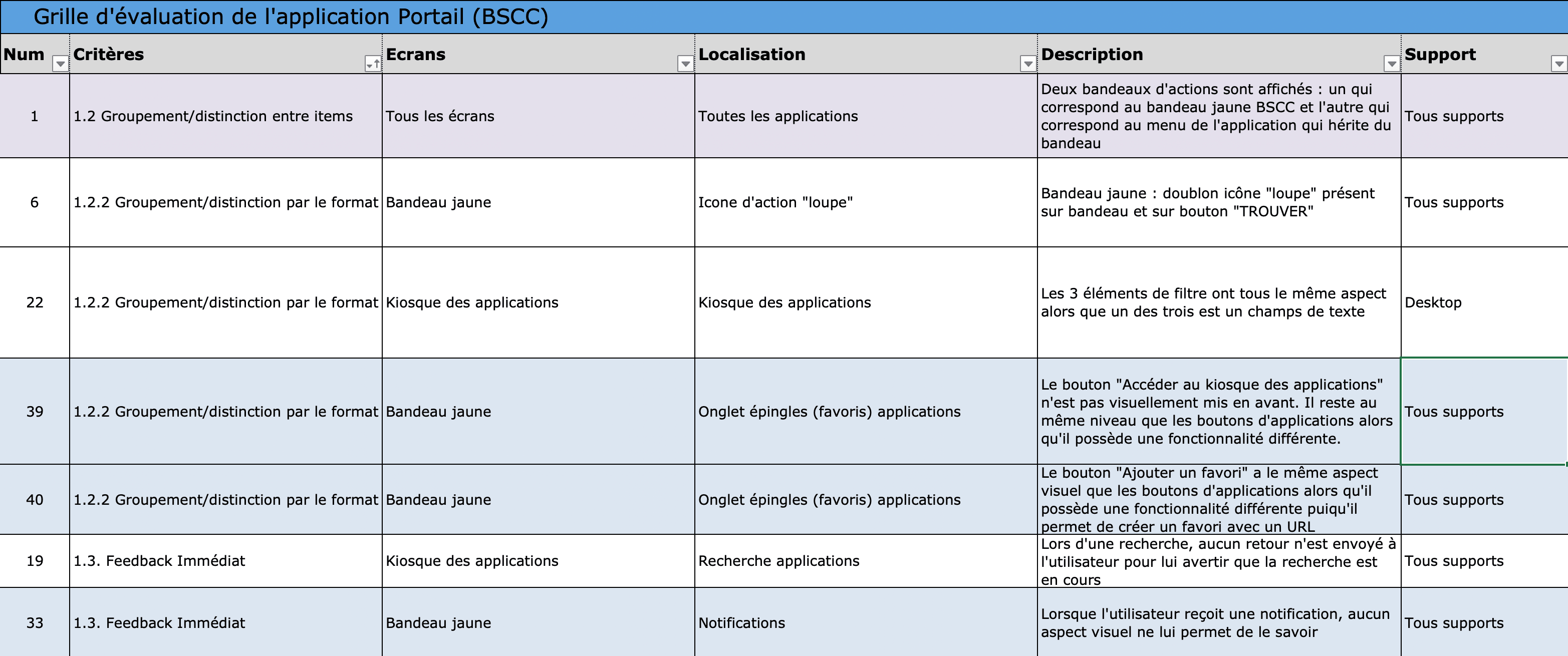
First of all, I worked on an audit of the intranet. Thanks to the "Bastien & Scapin" ergonomics guidelines, I made a list of each point which didn't respect those guidelines. This audit revealed 50+ ergonomics issue.
This audit, helped me to be aware of the design issues. However, fixing those ergonmic issues won't resolve the initial problem. That is why, I dig into user research. I needed to deeply understand users and their thoughts.
I had the chance to visit 3 mail-sorting centers in Paris. There, I interviewed 20 daily users of the platform. These are the feedbacks I got:
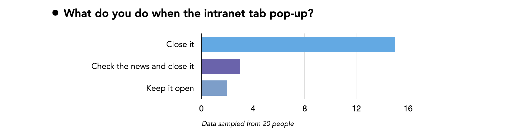
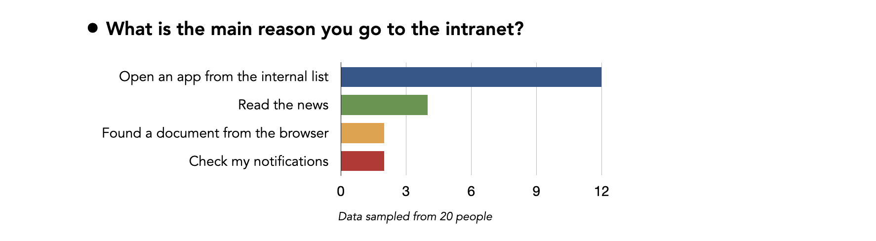
The results are overwhelming: the intranet is mostly used as a list of internal apps. Other provided services (internal news, browser...) are rarely used by users.
Obviously, there is an issue here. I assume that a top-down process has been used to developp the intranet. Final users have never been involved into the decisions. Let's reverse that by using a bottom-up approach.
From the data I collected during the exploration step, I gathered types of users depending on these variables:
2 personas stand out from the user research:
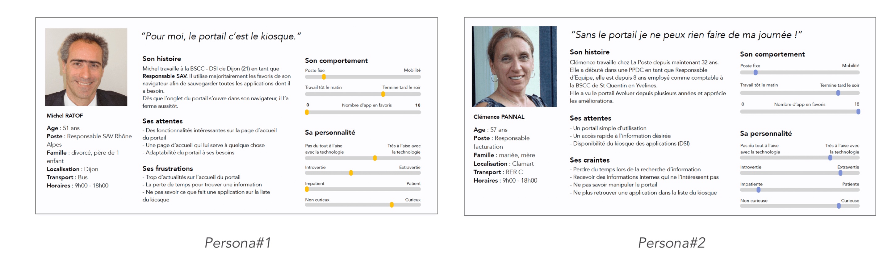
Persona#1 works most of the time from his desk, he prefers to use the intranet on a big screen. Furthemore, he is not familiar with new technology. Persona#2 likes working with a smartphone. She is familiar with computers, and love to custom her favorite shortcuts.
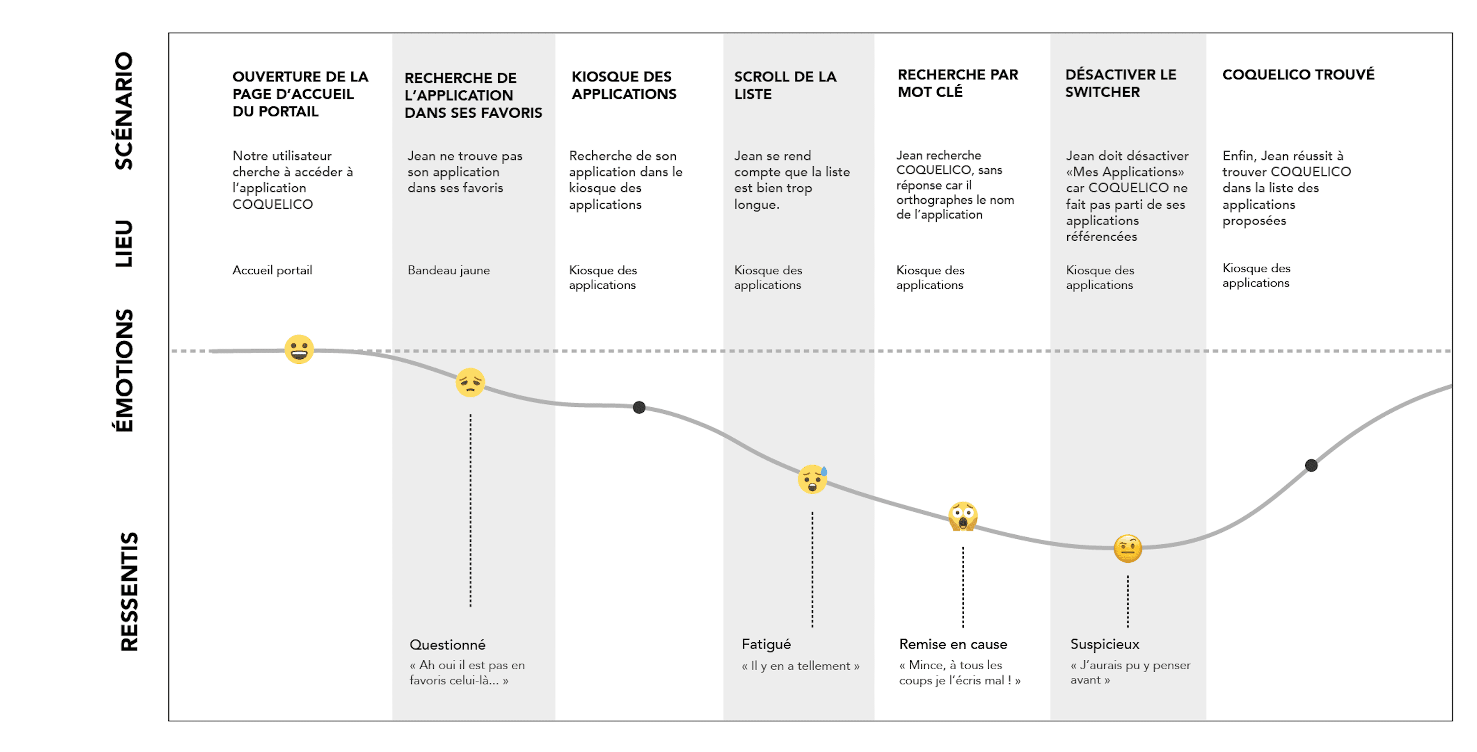
In order to deeply understand experience's weakpoints, I made a user journey map of a daily action: searching an application. As you can see, when users start searching for an app on the Post company app store, they got lost and don't find what they were searching for.
With user research, I learned user's behavior and habits. Then, ideation helped me to collaborate with users on keeping what they already use and like, while designing new features that may fulfill their needs and improve their productivity.
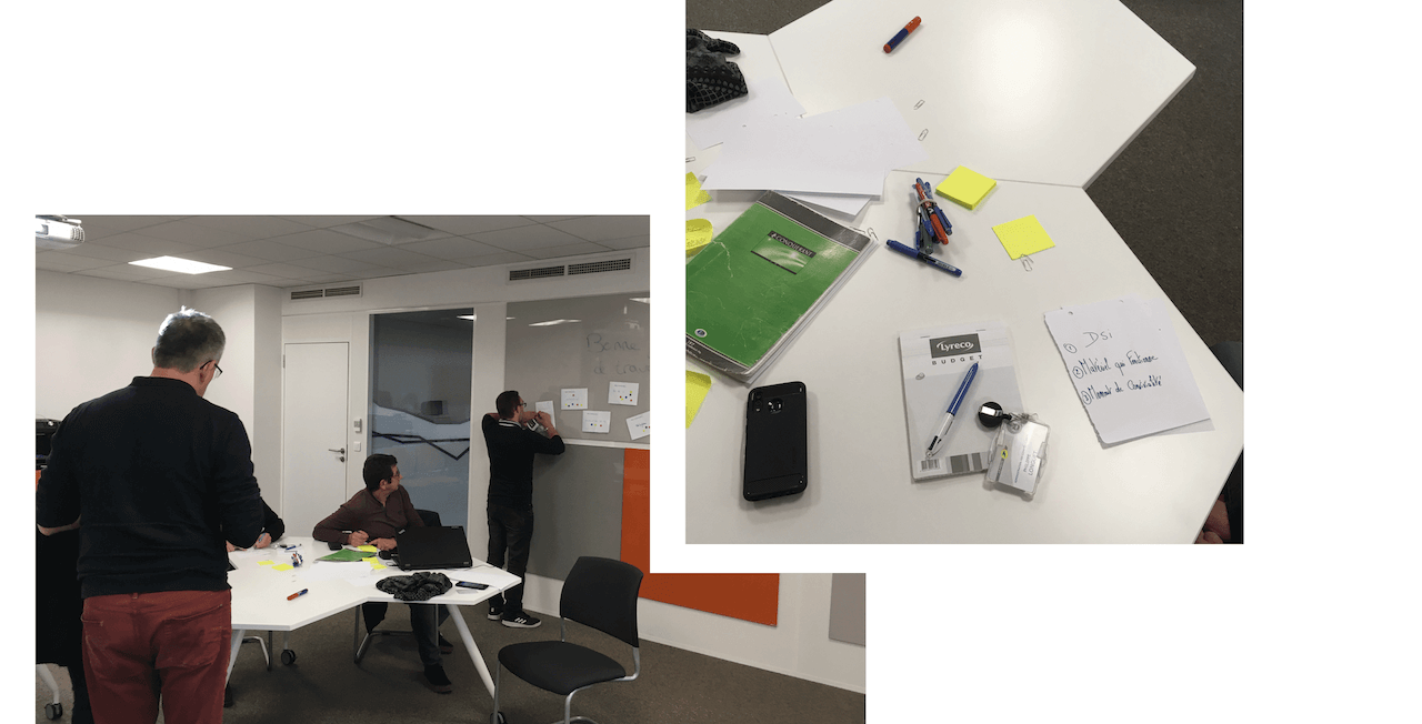
I invited 5 users (from the users' group I interviewed) to participate to a design workshop. I tried to pick up users who matched with these 2 personas, and from different departments (sales and logistics). During 2h, they collaborated as a team, and the result was amazing.
The goal of the workshop was to generate features ideas for the platform's homepage.
INPUT : persona & user's interviews OUPUT : new features
Icebreakers are very important in a design workshop. However, it was important to carefully choose icebrakers which really help the participants to generate ideas and get them more confidence in the "design process". During the main part of the workshop, we used the "The Lotus Flower" for generating new ideas.
The advantage of this tool, is to let people generate a lot of ideas from a simple sentence. And actually, it really helped the participants to think out of the box.
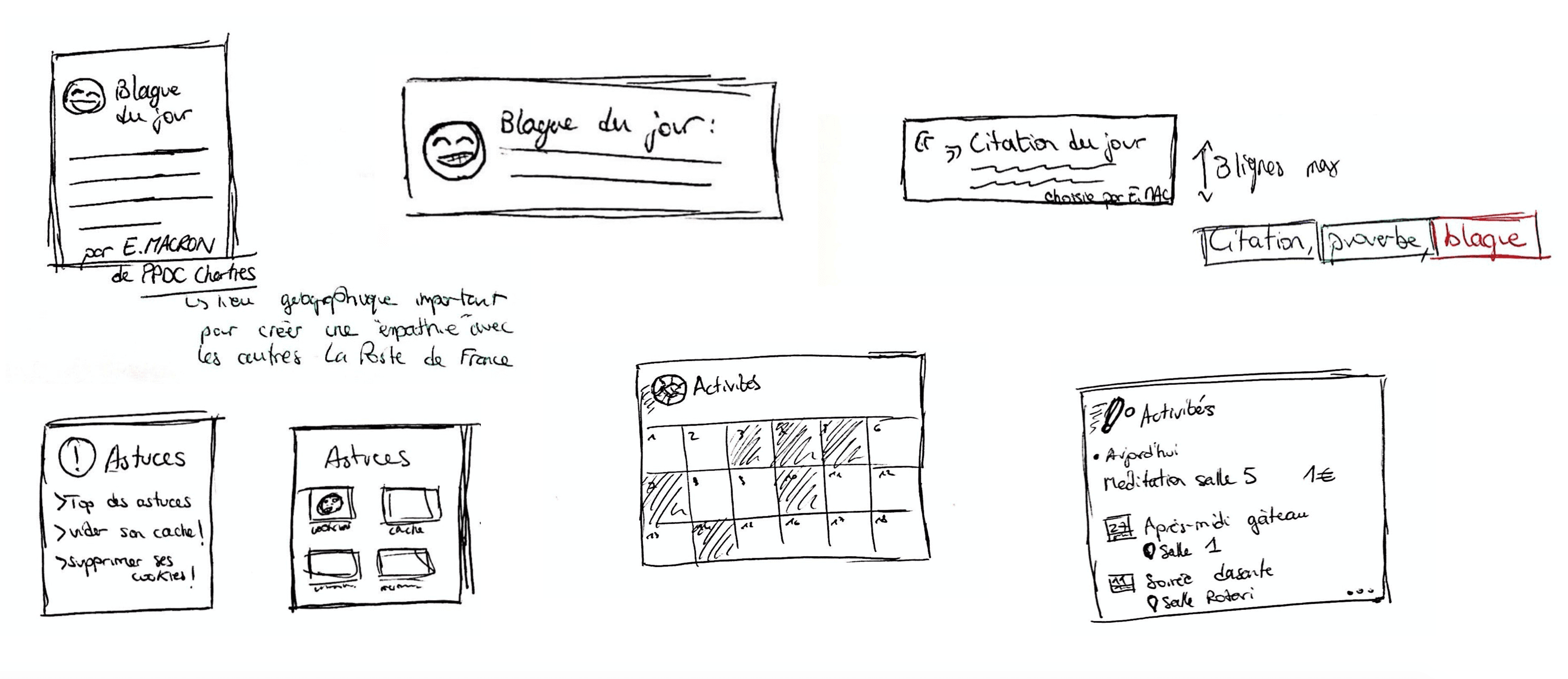
Here are some of the finale features participants designed:
After priotithizing the features designed by users at the previous step, we use paper and pen to sketch them.
Then, we used critique discussion with engineers and designers in order to iterate and take into consideration IT's constraints.
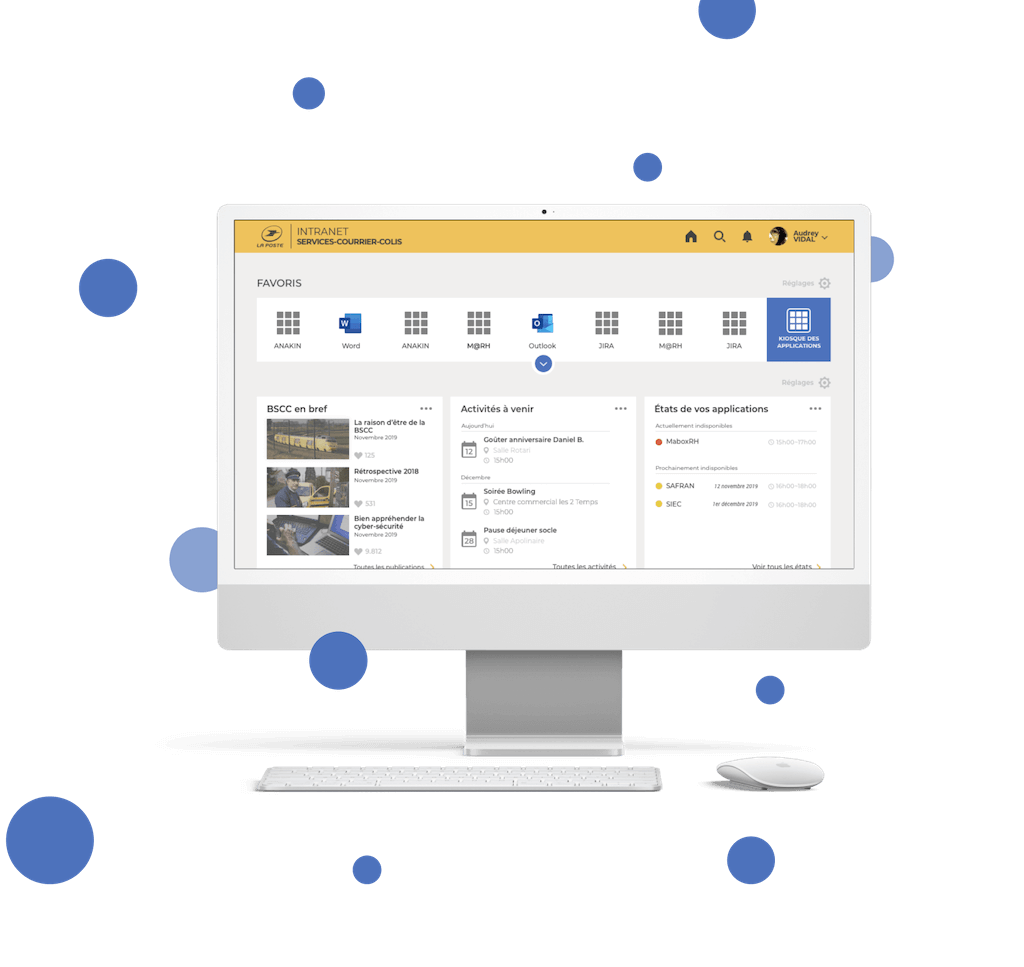
With all these new features, I needed to reorganize the homepage and how information are showcase to final users (information architecure). The challenge was to create a homepage that users want to use. The mental load shouldn't be too high in order to don't lose users not familiar with technology (persona#1).
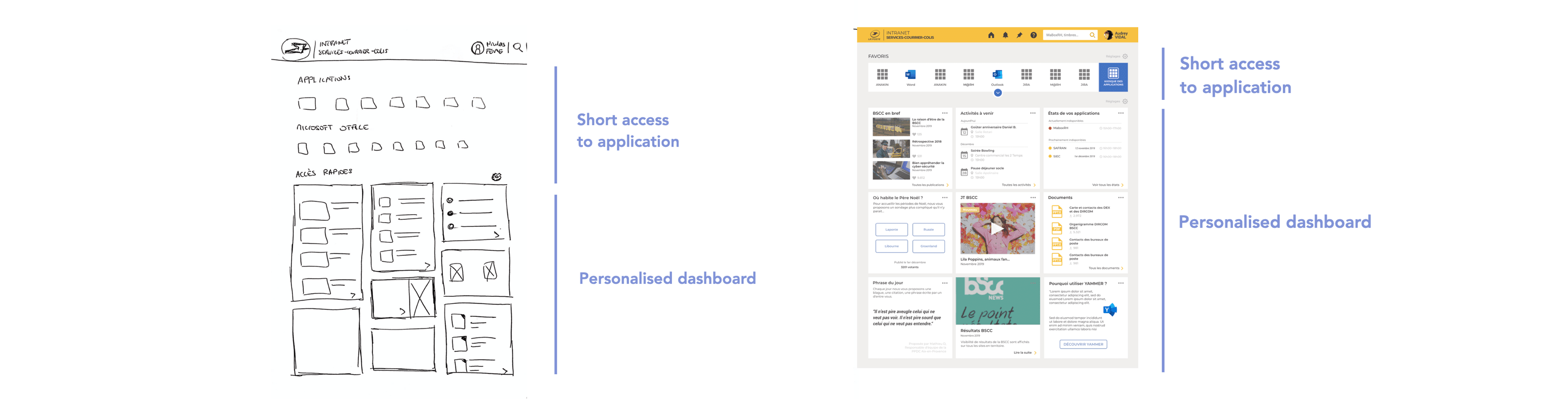
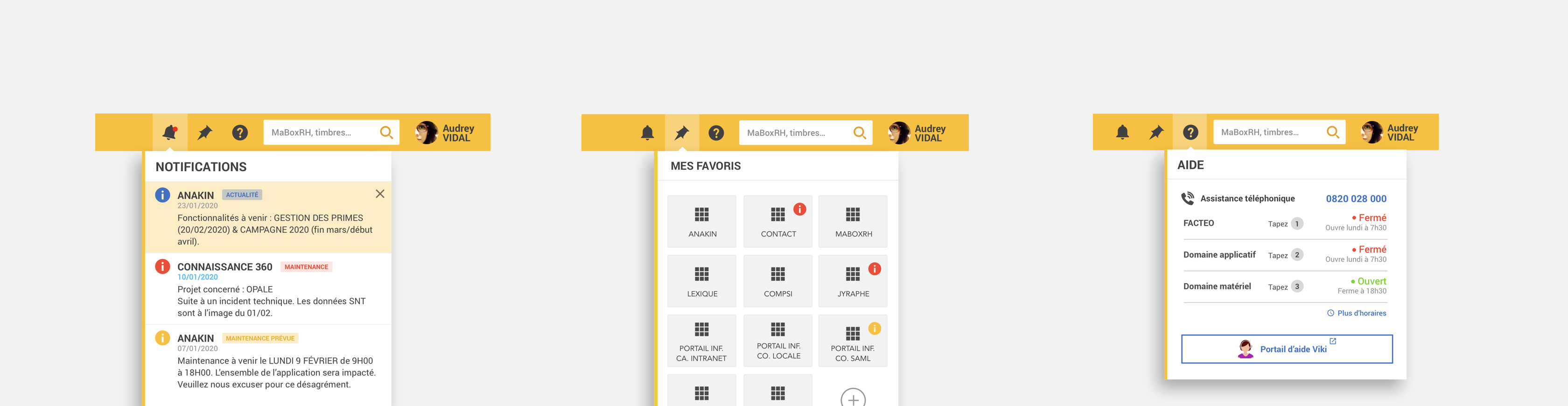
I worked on a navbar which can be used as a red wire within all the intranet applications.
In order to proceed these short iterations, we made online user tests. Using User Zoom solution from User Zoom company, we proceeded distance users tests to almost 50 users. Let's talk about one user test we made for the new application's index. I created 2 views for this page. I wanted to know which one was the easiest to navigate with, and which one display the information in the best way.
Many information are needed on each application cards, such as name, description, working state, browsers compatibility... User has to quickly move the look on all the cards and find the one he/she is looking for. It is not convenient and make the mental workload get high.
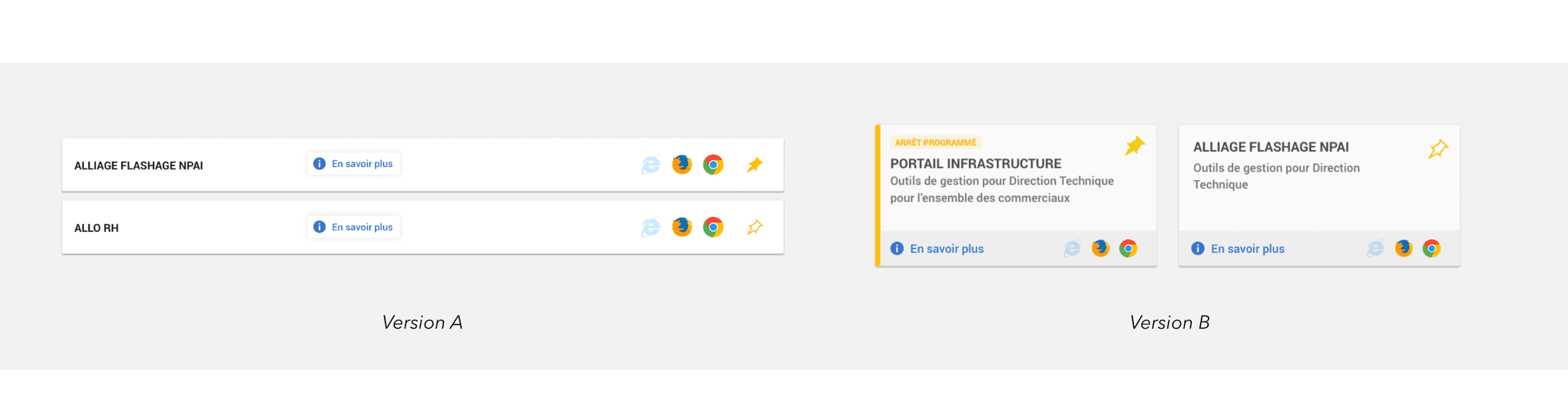
To our surprise, this had the opposite effect! Finally, users were more confortable using solution B.
A second aspect of the project has been criticised by users: the scrolling distance. With a same scroll distance, you can observe more applications with solution B than solution A. The mental workload level is higher, but the scrolling time is longer.